
I've never kept how I feel about Emily Henderson, as a designer and my pretend best friend a secret. She's just such a genius, and I loved that when watching her show there was always a moment when you thought she had completely lost her mind, and then in the end the room came together flawlessly. That happens to me sometimes...except the whole flawless ending thing...
No one can add whimsy and interest to a space like she can, and I can't explain how obsessed I am with her newest creation;
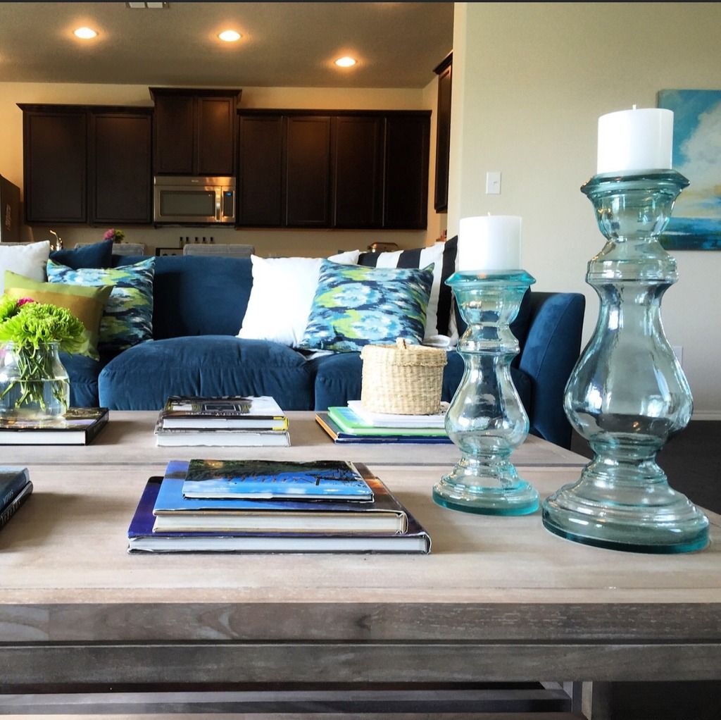
I present to ya'll for your eye-candy needs, the Country Living Magazine's House of the Year:

Where to begin....The mint color on the wall in the main living spaces is something I would never choose for most rooms, but here it just screams a day in the country. It's light and airy, and the blank walls keep your eye moving. Then there is the hammock in the living room, I can't be the only one that has dreams about this. It adds an amazing casualness and comfort to the room, that just can't be recreated.....without a hammock in the living room.

The teal on the walls in the bedroom and on the cabinets in the kitchen is seriously a perfect color. Benjamin Moore Oasis Blue, so gorgeous.


Then there's my absolute favorite part of this house, those dining room chairs. I've actually been crushing on these chairs from World Market for awhile, but the wood tone was never right in my home, Emily fixed this by painting them that same amazing Oasis Blue color, and they are jaw droppingly (not a word) perfect. I am so tempted to do this....like today, but I'll hold off for awhile...maybe.
The dining space is another space that just screams cozy up here with a cup of coffee and the newspaper. I have been long into the idea of using a settee or sofa at a casual dining space, and this space just puts it over the top. I also think that the pendant in this space is pretty perfect. Since you can see through it, it's visually light and doesn't take away from the other great moments in the space...Brava Emily...

....And then there is that amazing tile in the bathroom, if it wasn't on a bathroom floor I would probably rub my face all over it...it's that stunning. It's by Granada Tile, for those that are curious...and you should be.
Now, go to her blog, and read all about this amazing makeover.....seriously leave.
Absolutely gorgeous, I don't really understand the mirror over the window though in the bathroom? Seems awkward. But you are right that tile is amazing.
ReplyDeleteI completely agree with Leesa! Beautiful home, but that mirror is awkward and probably not very useful since you would only see your chin most likely.
ReplyDeleteI can see why it could be awkward, but I actually liked the choice. It's interesting. Think of it this way; the family needs a mirror above the sink, most likely the sink had to go there because of the plumbing, and she didn't want to cover a beautiful window. I think in the end this was probably her best option, besides we are talking about it, so it is a conversation piece ;)
ReplyDeleteI agree with you, Ashli, there was obviously a good reason for it, but I think I'd prefer just the open window then.
ReplyDeleteI've always been an Emily fan and this house just makes me love her even more!!
ReplyDeleteI know, this house is exactly why I love her!
Delete